How we built a multi-platform product page that lifted conversion
We turned a duplicated (and inconsistent) PDP into a reusable web-based page, standardized by the design system, and improved the experience based on research.
Year
2024
Platform
Web/iOS/Android
Role
Design Lead
When one page becomes four projects
At Magalu, the product page was, in practice, four different projects: iOS, Android, mobile web, and desktop web. Even with identical goals, each implementation had its own backlog, priorities, and squads, which created inconsistency, rework, and an operational bottleneck that was hard to scale.
The shift was simple and structural: what if there were only one web-based product page, reusable across all platforms?
That is what we built, and we used the moment to raise the experience based on existing research plus new benchmark and interview inputs.
What we learned before starting
We benchmarked major e-commerce players, ran user interviews comparing Magalu’s experience to competitors, and reached a few key conclusions for the project:
- Other players were already adopting a web-based approach inside apps.
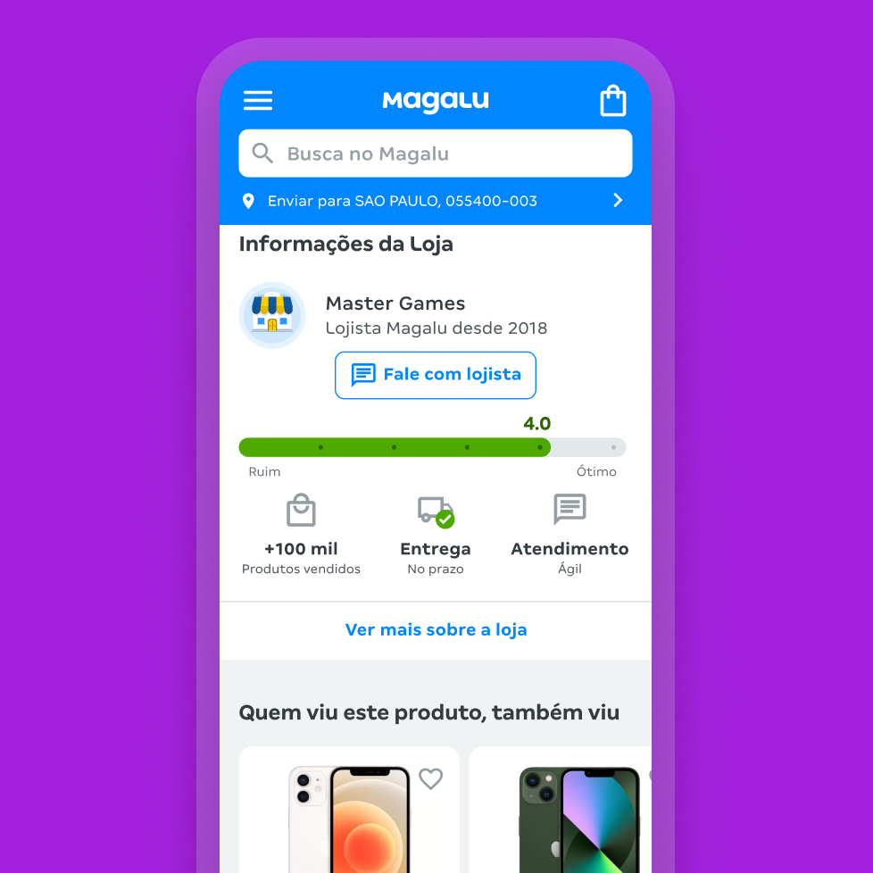
- Pages with richer content and more useful recommendations.
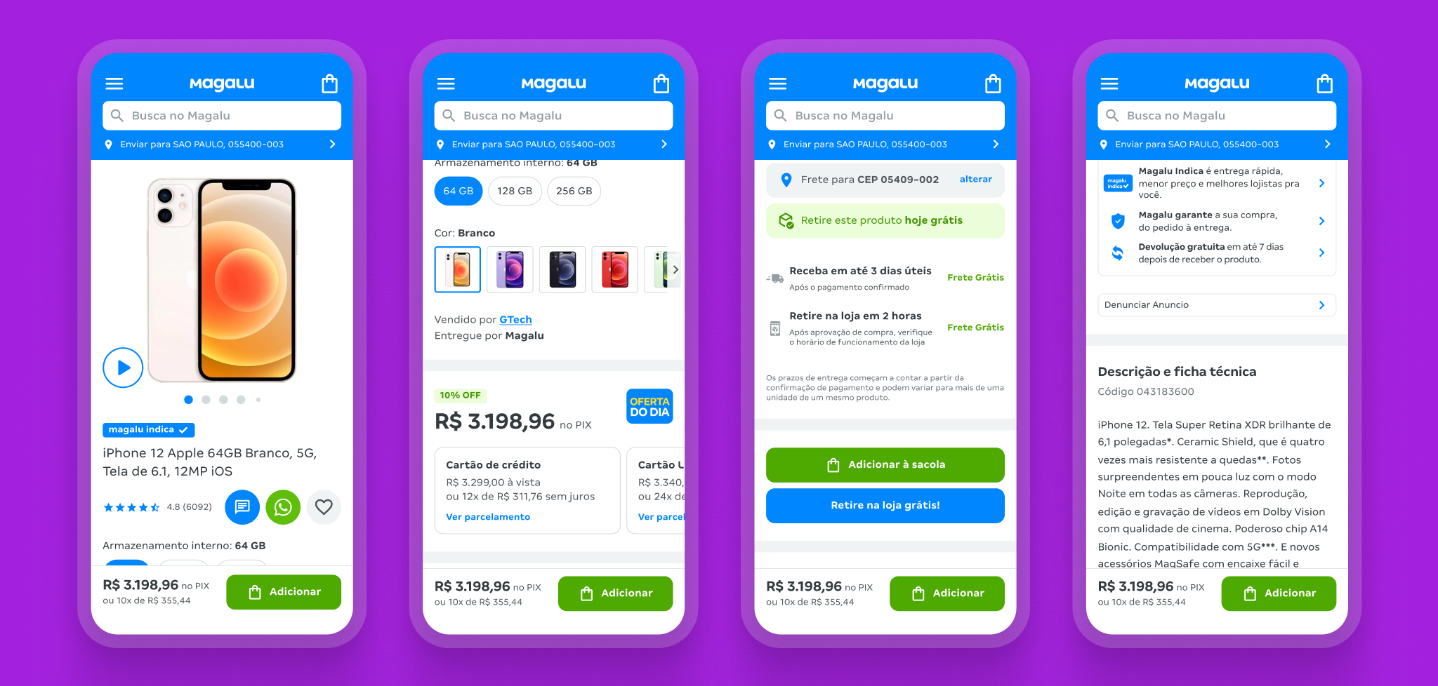
- Technical information more exposed and accessible.
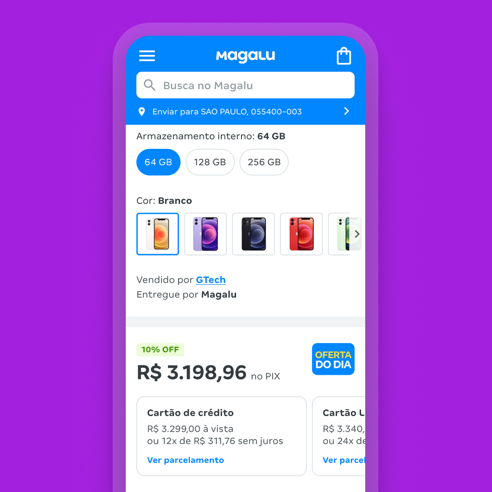
- Commercial terms (price/installments) clearer.
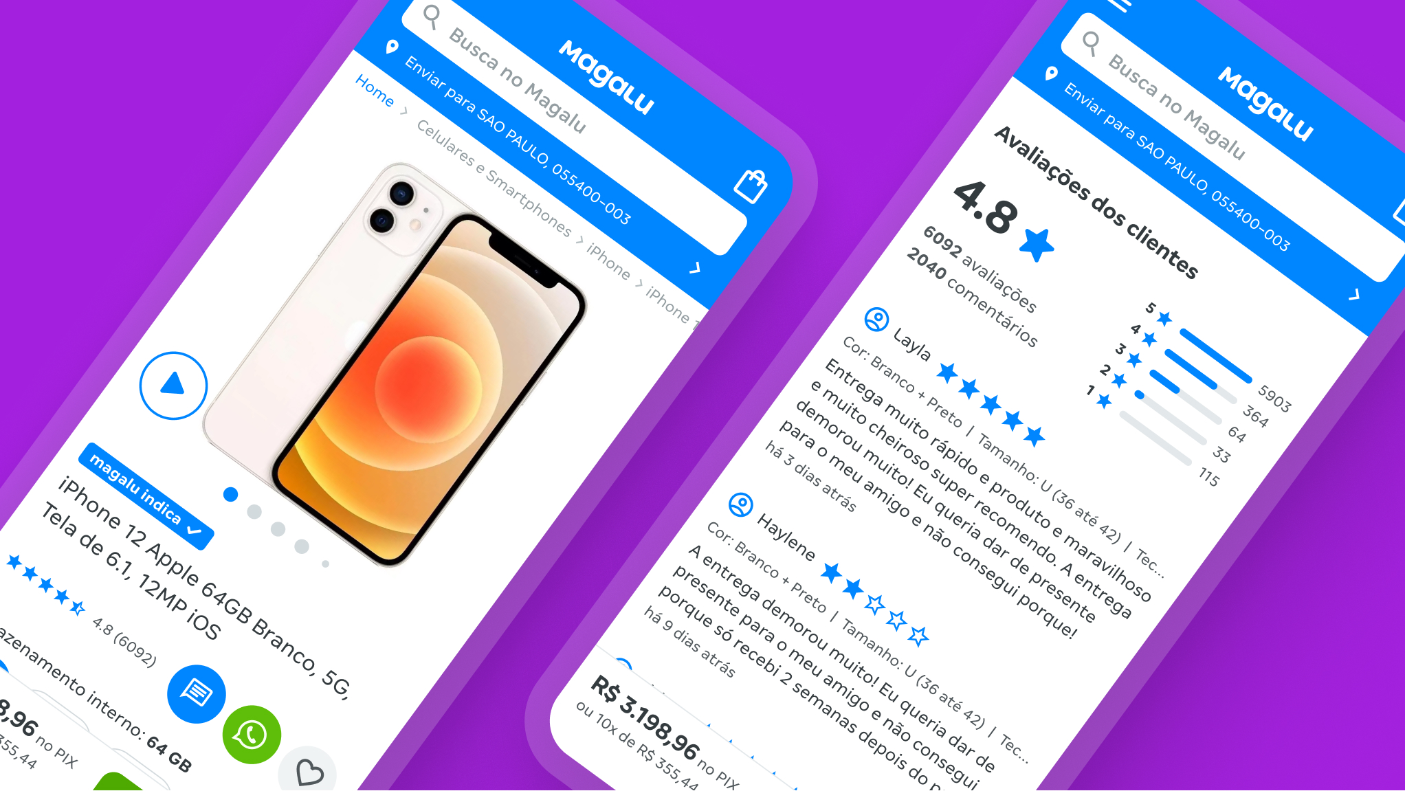
- Reviews felt incomplete: photos/videos were missing and AI summarization could help.
- Payment options felt “hidden” at the end of the page.
- Technical sheets and specs were harder to find than on other players.
What was our proposal?
- Through a reusable web base, unify the PDP, reducing 4 implementations (iOS, Android, mobile web, and desktop) to a single source of truth.
- Standardize UI and content via the design system, reducing divergence across platforms and design/dev rework.
- Define hierarchy principles and reorganize content by activity (less noise on screen and easier decisions).
- Bring conversion levers forward (payment, reviews, shipping/promo) so they appear earlier and more clearly.
- Improve findability of product information (technical sheet and specs) without burying content at the bottom of the scroll.
Results
+10% conversion on the page
Early results showed a clear uplift after implementation.
Faster decisions at the point of purchase
We made payment, installments, CTAs, and offers more immediate (payment strip + buybox), reducing hesitation and increasing price/terms clarity.
Consistent experience
We aligned app and mobile web patterns across every element.
Foundation for experience scale
We created a base for continuous evolution, with improvements made once and distributed to all channels.