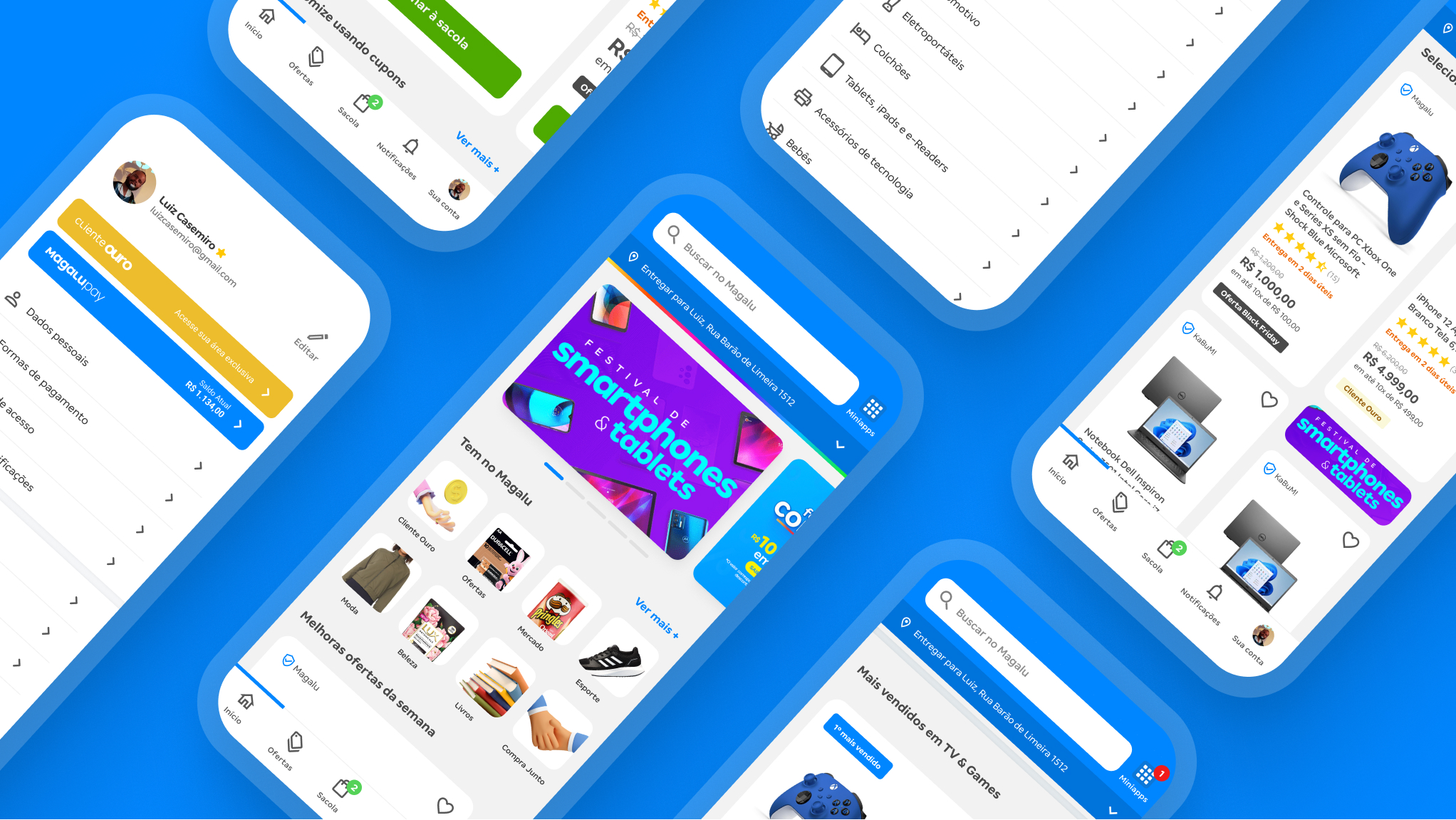
Scaling mobile design at Magalu via a design system
Native mobile system for iOS and Android: foundations, components, and governance without halting product delivery.
Year
2020-2024
Platform
iOS/Android
Role
Design lead
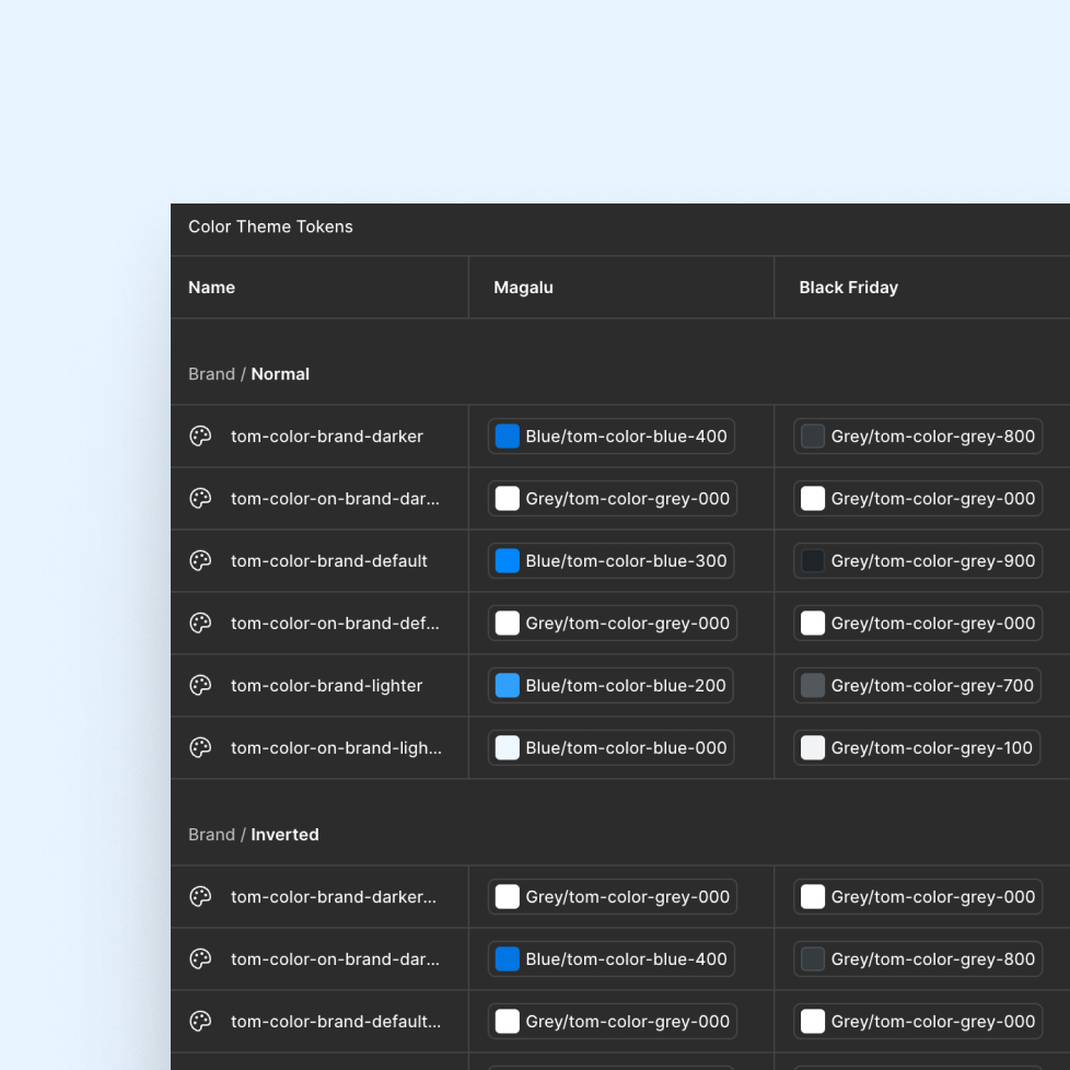
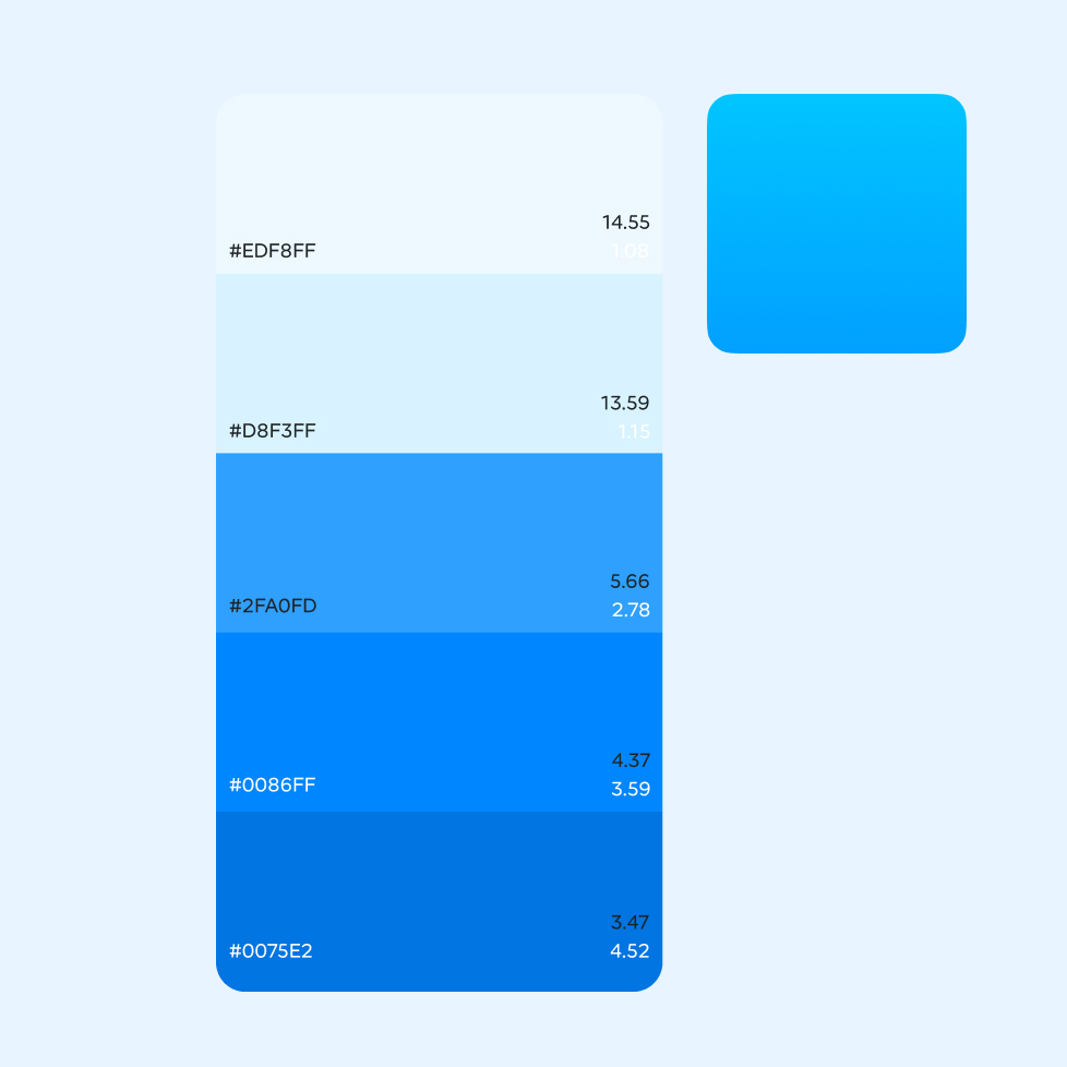
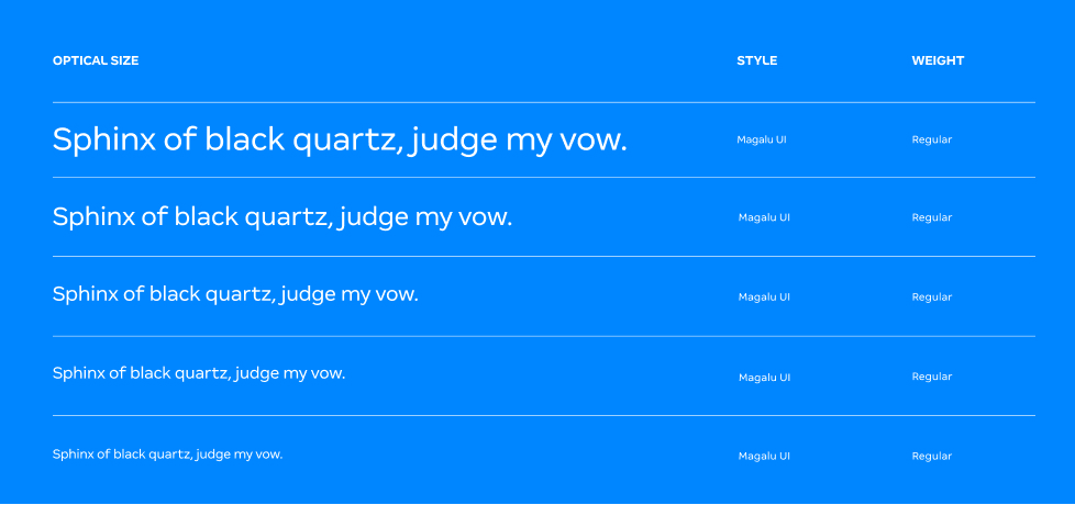
Concept used to direct the system’s visual language
Key discovery findings
We started by listening to teams and zooming in on UX delivery. What seemed like “variation” became a clear diagnosis: inconsistency, documentation debt, and handoff issues. We ran a pilot to map the efficiency gains in development.
- Same component with variations across squads
- UX guidelines with different views inside the same product
- Constant rework in the design–engineering handoff
- Mobile experience lacking consistency and scale
- Pilot component showed a 95% reduction in lines of code
Work streams
We adopted a simple principle: introduce the design system without creating entropy. Working side by side with squads, we listened continuously and prioritized the backlog by real day-to-day usage.
- Governance: rituals, intake, and stakeholder alignment
- Co-creation: workshops with designers and devs
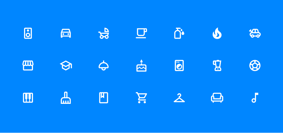
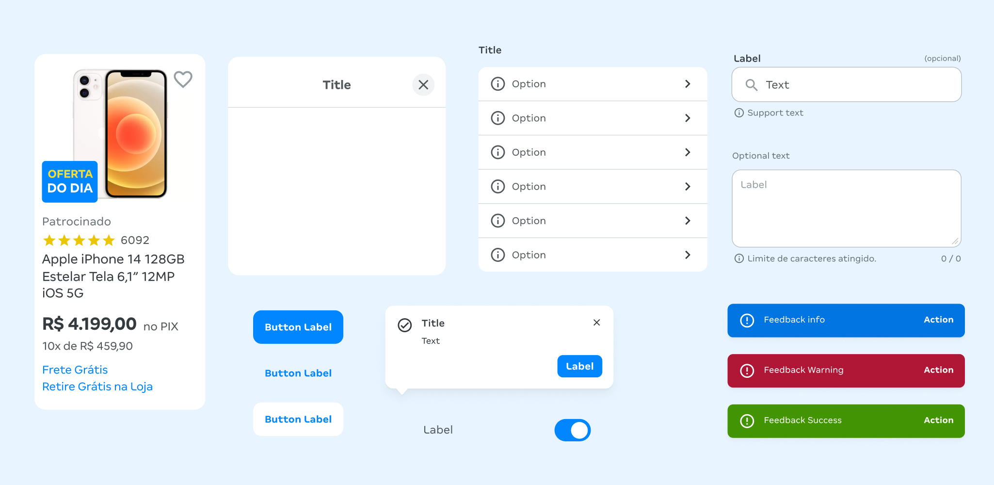
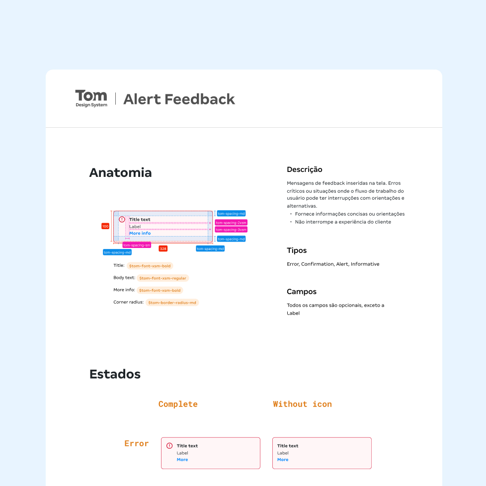
- Foundations: tokens and patterns (type, colors, spacing)
- Components: library and documentation in Figma
- Adoption: quality, coverage, and usage metrics
Impact
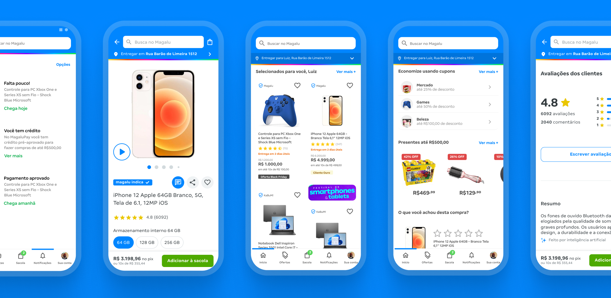
100% adoption in new projects
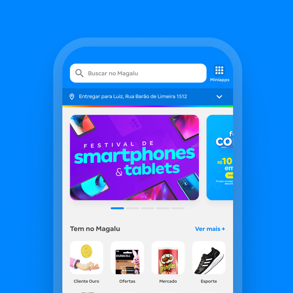
Mobile e-commerce squads adopted the new design system.
Improved UI quality
UI bugs became rarer and were handled by the DS team.
Accessibility
Accessibility coverage increased, and the design system ensured WCAG 2.1 AA compliance.
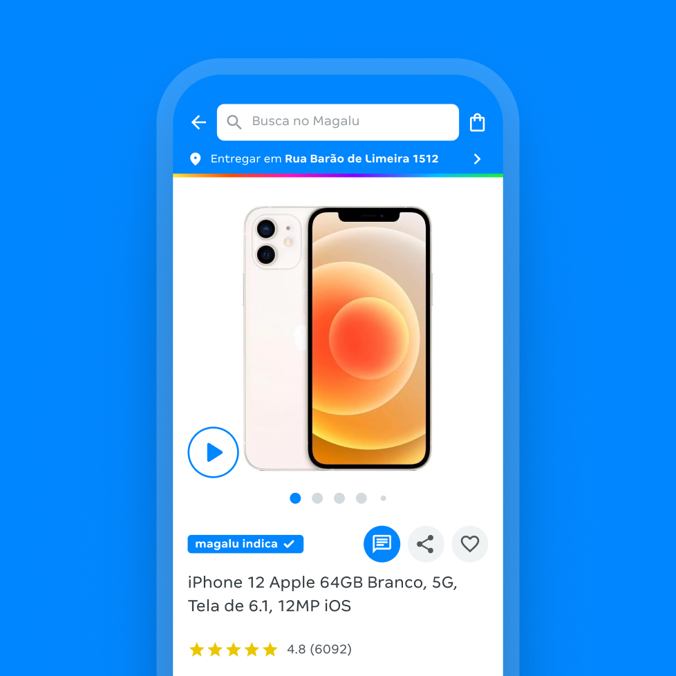
iOS and Android parity
Both libraries were built together and were visually identical, reducing inconsistencies.